Work / 01
Tefity
One visual language for a nature-led skincare brand, from the logo to campaigns.
Challenge
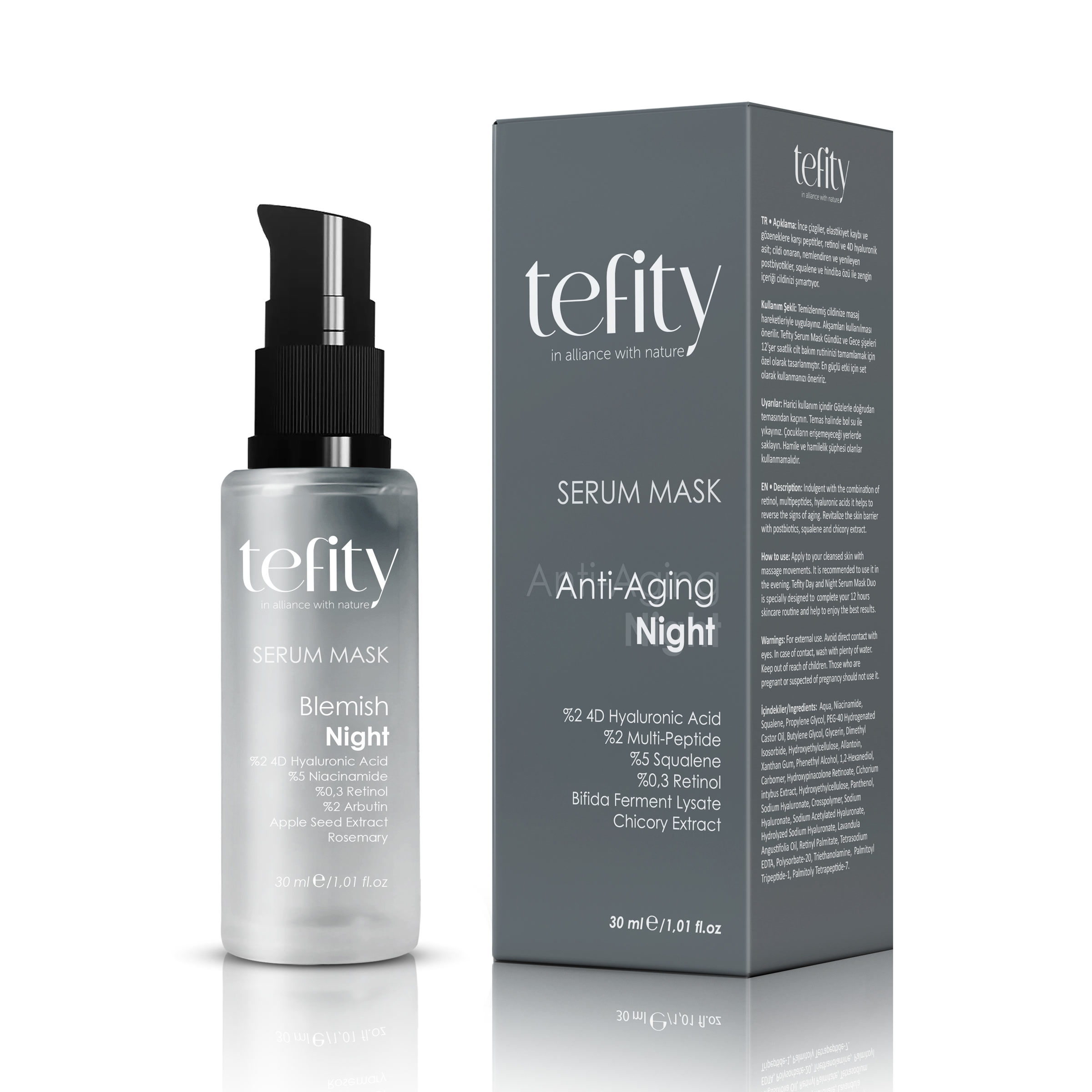
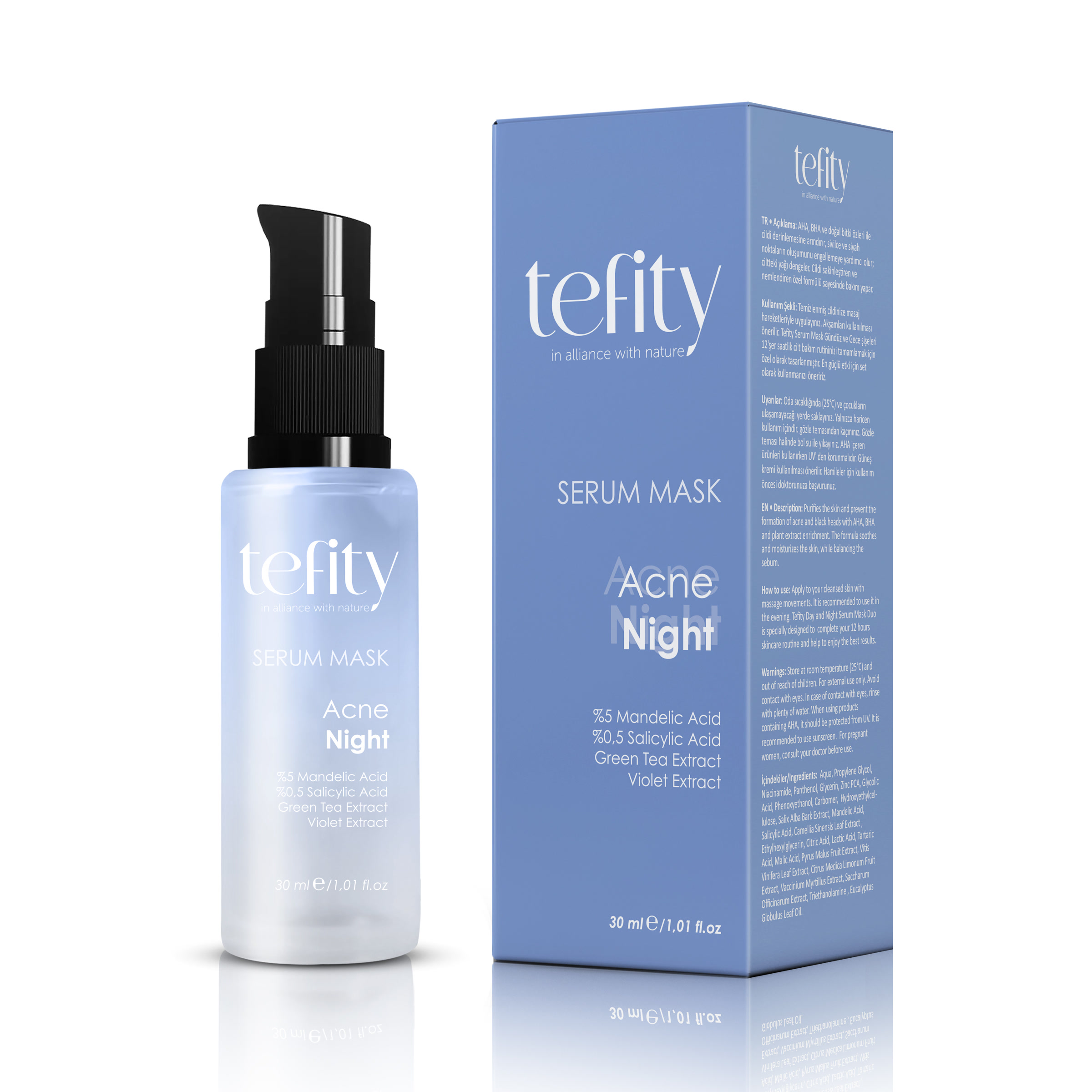
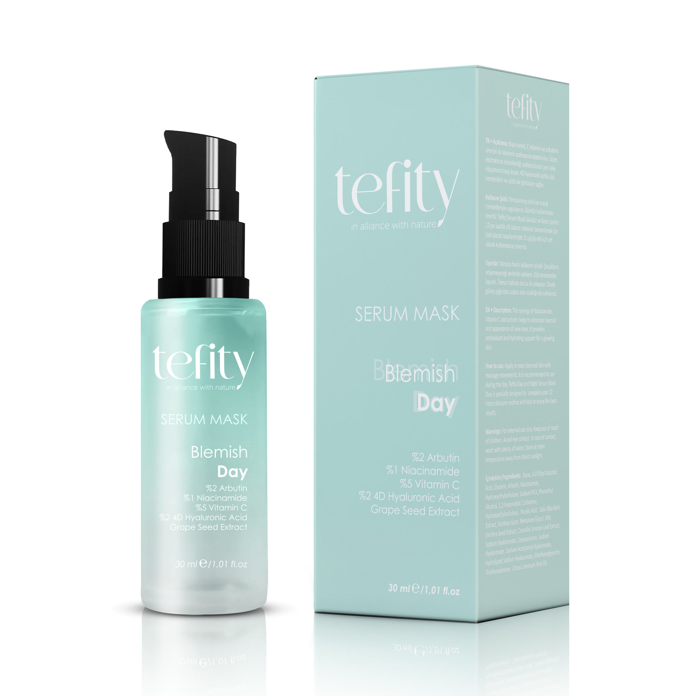
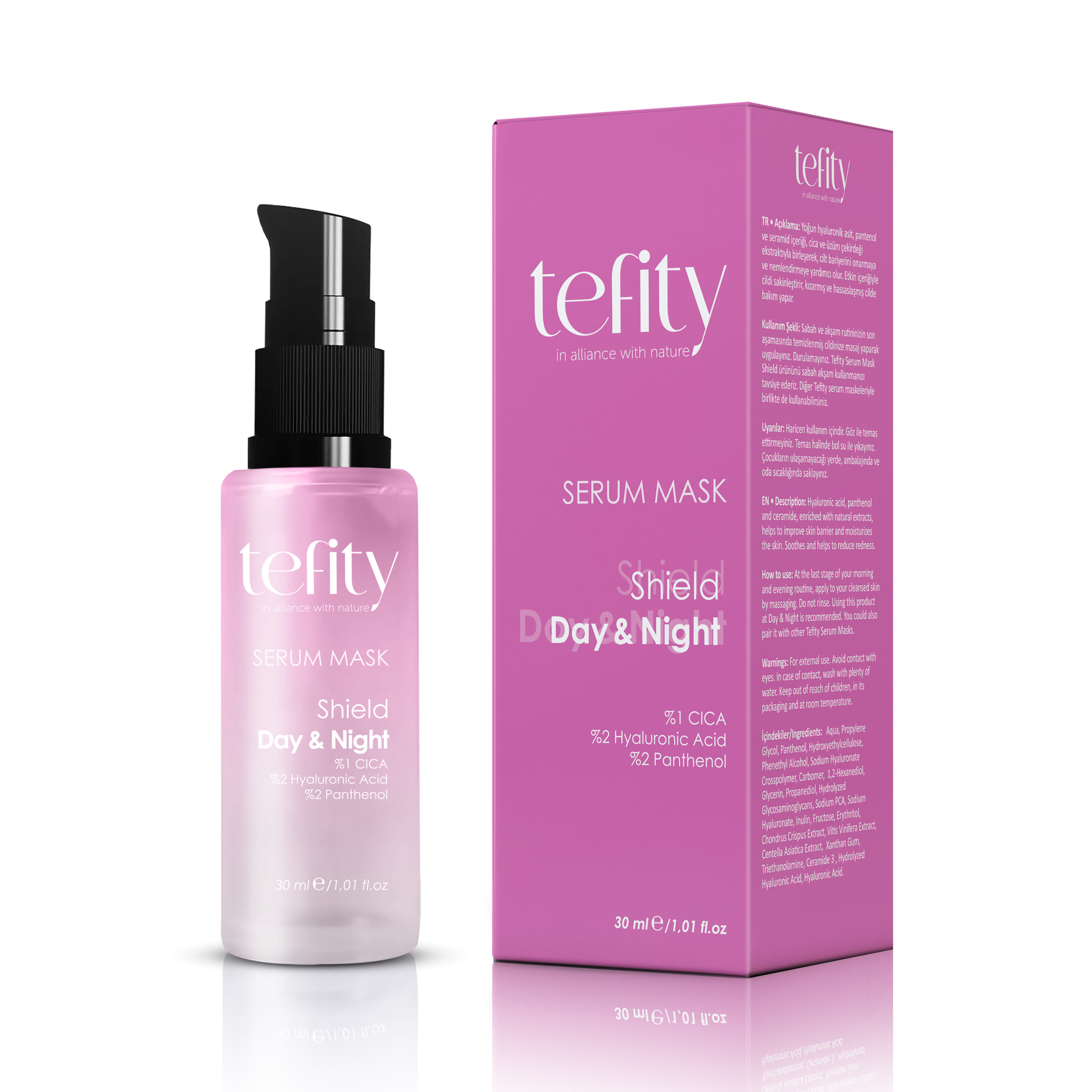
Tefity's range runs from day and night care to acne, blemish and anti-ageing lines. Each product had to stand apart on the shelf while clearly belonging to one brand, and a year-round campaign calendar called for fast yet consistent production.
Approach
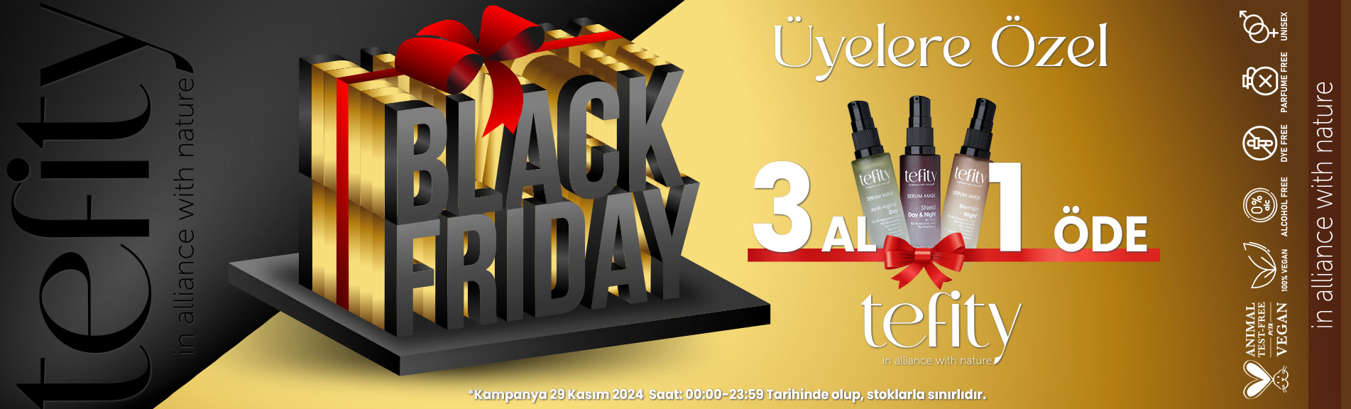
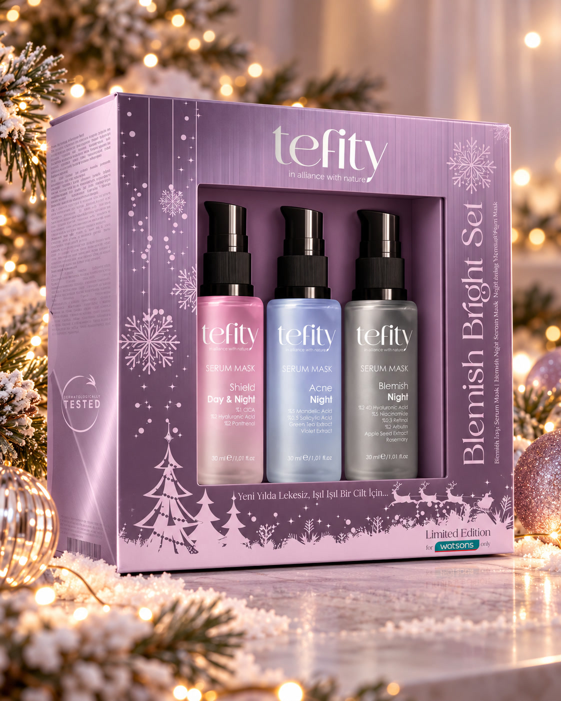
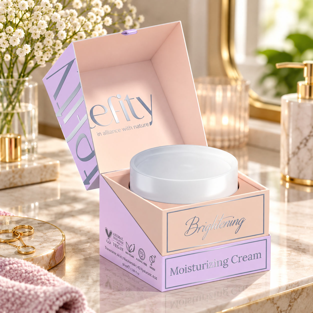
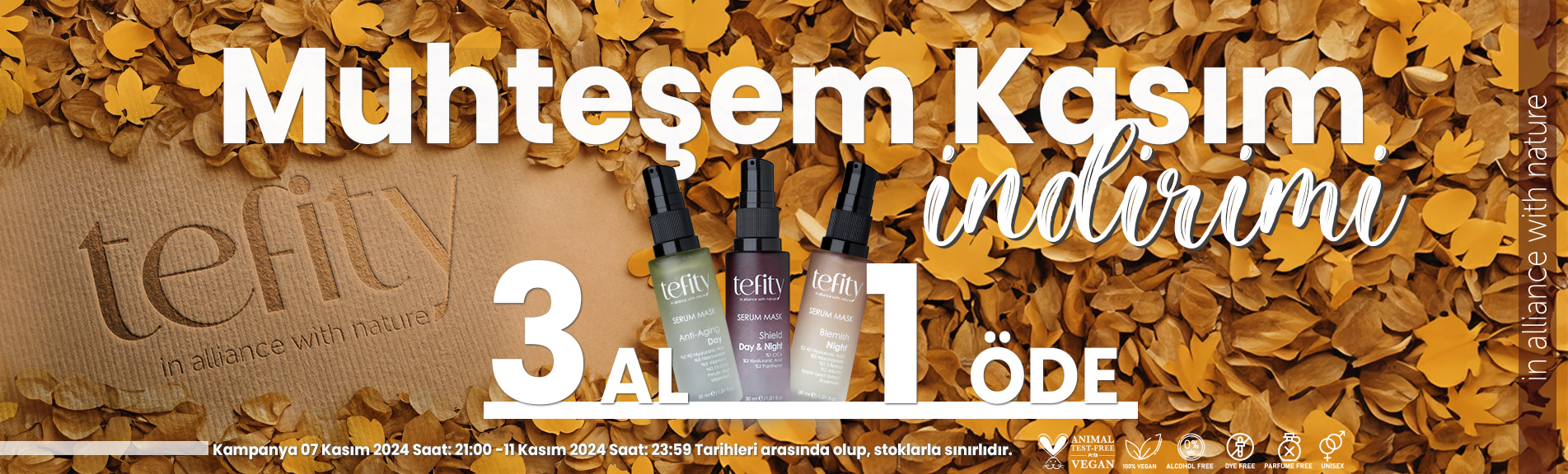
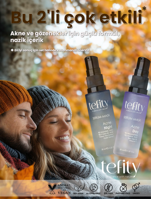
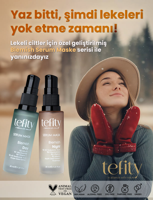
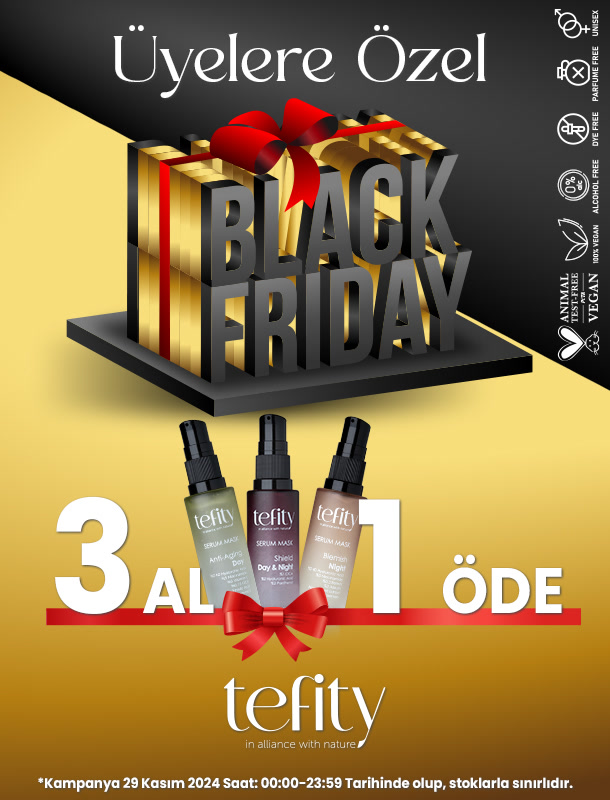
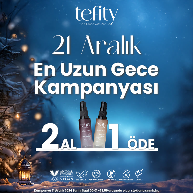
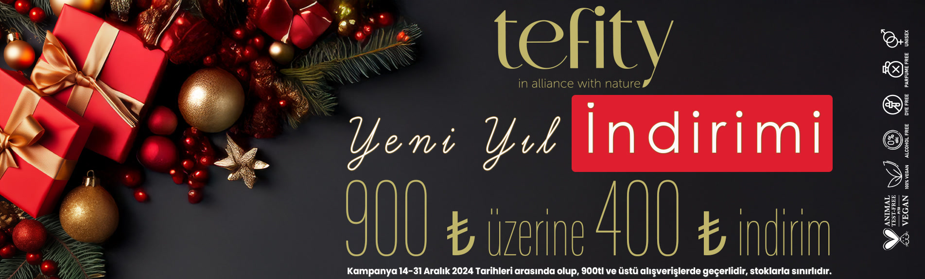
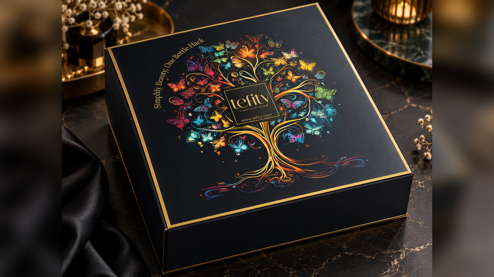
We started by designing the brand's logo. Each line received a pastel colour code within a shared typographic layout, and the boxes were designed on that system. 3D mockups let every campaign use the products without new photo shoots. Black Friday, November, New Year and "Longest Night" campaigns were produced for web, mobile and social in the same language, while gift sets and a PR box carried the brand into a physical experience.
Outcome
A single visual system that carries the whole range and adapts quickly from one campaign to the next.